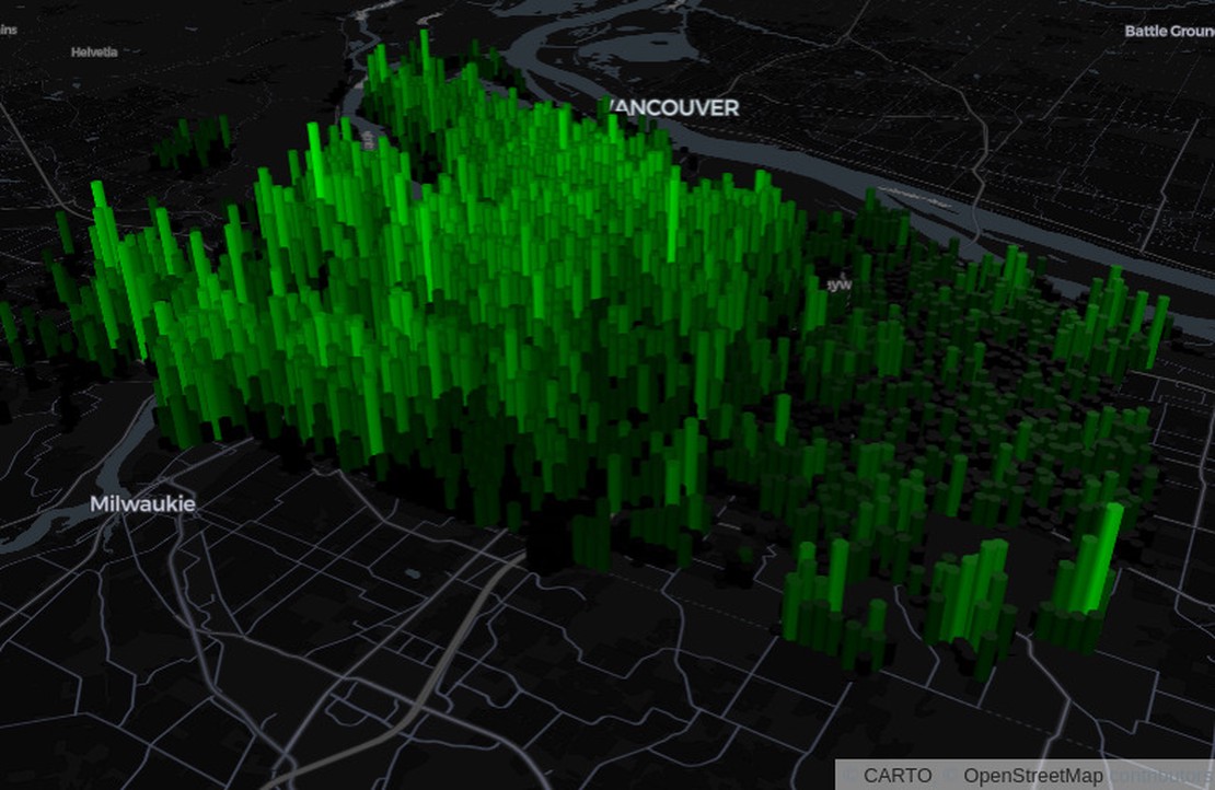
Portland is one of my favorite US cities. I love its unique vibe, food cart pod
scene, alternative transportation options, and many parks. Before giving a
promotional presentation for a soon-to-be-taught Geography Field Seminar course
to Oregon, I stumbled upon the pdxTrees R package and at the same time had
been experimenting with 3D visualizations through deck.gl. I decided to put
these two together for my presentation and was satisfied at how quickly and
easily I could produce an interactive of map 200,000+ trees.
There are several R packages available for 3D visualization, and here I use the
deckgl package which connects to Uber’s JavaScript library deck.gl. The
pdxTrees package is super simple and contains two functions for retrieving
data on tree locations (among other variables) in the city of Portland: one for
trees within the 174 public parks (get_pdxTrees_parks) and another along
streets of all 96 neighborhoods (get_pdxTrees_streets). The approach
demonstrated here would work for any point geometry data, however, as long as x
and y are appropriately specified.
I decided to visualize the density of street trees, and the function below simply reads a .csv currently hosted on github:
There’s an impressive number of tree locations in here (over 200k) which were collected as a part of the Urban Forestry Tree Inventory Project.
## [1] 218602Since there are that many rows however (and 23 columns), we can improve performance by simplifying data a bit:
Next, we’ll create list of properties that will be passed to the
add_grid_layer function later on. These include options for how deck.gl will
handle visual style.
props <- list(
extruded = TRUE,
cellSize = 200,
elevationScale = 4,
getPosition = ~Longitude + Latitude
)The extruded option simply makes the visualization three dimensional. The cell
size is the size of each grid cell in meters. The other options are
self-explanatory.
Then, the deckgl function initializes the deck.gl instance with some options
that are common to all visualizations (e.g., zoom, pitch, bearing, and lng/lat).
The add_grid_layer function is where our data is actually plotted with a color
range and set of properties (specified above).
deckgl(zoom = 11,
pitch = 75,
bearing = -30,
longitude = -122.6138,
latitude = 45.5163,
width = "100%") %>%
add_basemap() %>%
add_grid_layer(
data = df_small,
colorRange = RColorBrewer::brewer.pal(8, "Greens"),
properties = props
)This turns out pretty well, but it’s almost a carbon copy of Stefan’s (creator
of the deckgl package) example from the README. I wanted to customize this a
bit further, so I modified the properties and decided to use a different
deck.gl visualization: hexagons. I also wanted to use a custom color ramp since
I like the dark background of the default basemap but thought the low end of the
scale should be black (to match the basemap) with the high end being neon green.
Then, I use the add_hexagon_layer function instead of add_grid_layer.
props <- list(
extruded = TRUE,
elevationScale = 3,
radius = 100,
alpha = 0.5,
getPosition = ~Longitude + Latitude
)
# black
start_col <- rgb(0,0,0)
# neon green
end_col <- rgb(0,255,0, maxColorValue = 255)
# create color ramp
color_ramp <- colorRampPalette(c(start_col, end_col))
# make it 8 colors
colors <- color_ramp(8)
deckgl(zoom = 11,
pitch = 75,
bearing = -30,
longitude = -122.6138,
latitude = 45.5163,
width = "100%") %>%
add_basemap() %>%
add_hexagon_layer(
data = df_small,
colorRange = colors,
properties = props
)It’s pretty cool that over 200,000 points can summarized and visualized so quickly and just as cool that the data for this quick demonstration was made so conveniently available.
There have been some great debates on LinkedIn lately about the value of using R
for these types of problems, particularly through web applications created with
shiny.1 This is obviously a static web page, and for example shown here, it
would probably be simpler to use the native deck.gl JavaScript library directly
and connect to the publicly available data source without even downloading it.
However, if any additional spatial or statistical analysis was needed between
the steps of accessing the data and visualizing it, R would shine, and it
conveniently ties all of these pieces together.
See Yan Holz’s Is it the end of Shiny/Streamlit? and Kyle Walker’s follow up post.↩︎
