
Urban growth boundaries (UGBs) are used to reduce sprawl, preserve farmland, and force development toward city centers. While there are significant debates about their tangible impacts, in theory they should create greater residential population density. While explicitly constraining urban growth is a standard planning practice in most European countries, only three states in the US mandate them: Oregon, Washington, and Tennessee. In this post, I’ll conduct several binary comparisons of residential population densities in states that mandate UGBs with those that do not.
Of course, the usual caveat applies: differences in residential densities do not imply causation from UGB mandates directly. Other state policies – not to mention, physical geography – vary too greatly and are far too complex to neglect as influential factors in determining density. Nevertheless, the exploration itself is informative, and the approach here can be reused for other purposes and can aid in exploring other spatial questions.
Primary comparison: Oregon and Wisconsin
First, I’ll compare population densities between towns in Wisconsin (my home state) and Oregon, the state perhaps most closely associated with UGBs. Aside from its UGB requirements, Oregon is known for other innovative urban planning practices. Orenco Station in Hillsboro is one of the most prominent examples of transit-oriented development in USA. The Oregon coastline is the “most democratized” – i.e., publicly accessible – in the country. Plus, the disaster prone nature of this coastline necessitates strategically crafted tsunami evacuation plans for every coastal community. These characteristics both necessitate and reflect a strategic focus on planning.
To conduct this comparison, I utilize the R Project for Statistical Computing
and US Census data. I create visualizations using ggplot2 and compare
densities using a Mann-Whitney U-test (that is, the non-parametric analog to
the independent samples t-test).
First, I load necessary packages:
library(tidycensus)
library(dplyr)
library(tidyr)
library(sf)
library(ggplot2)
library(ggridges)
library(kableExtra)
Since we are interested in population density, we need to use a geography that
most closely corresponds with this measure. I’d argue that places – i.e.,
municipal boundaries – do this most effectively, even though density obviously
varies greatly within cities, and there can of course be areas (potentially
large swaths) within a city where no people live.
tidycensus conveniently retrieves geometry with geometry = TRUE, and the
variable B01003_001 contains population data. We can easily calulate
population density by dividing the population (estimate) by land area,
calculated with st_area, but note that this has to be done after a
transformation to a projected CRS to ensure accurate areas. Since the units of
the CRS are in meters, we can multiply the result by 1e6 to get kilometers but
should convert this from a “units” data type to a numeric to be sure we don’t
confuse future users (including ourselves).
We can retrieve data for all US states by not specifying the state argument
and then simply filtering by the first two digits of the GEOID which contains the
state FIPS code. We could instead use data.table’s %like% operator on the
NAME field since these contain the city and state name (e.g., “Eau Claire
city, Wisconsin”), but I could think of a few places where this could
potentially fail (e.g., Nevada city, Missouri), so using the FIPS code is a
little safer.
us_pop <- get_acs(geography = "place",
                  variables = "B01003_001",
                  year = 2023,
                  survey = "acs5",
                  geometry = TRUE,
                  progress_bar = FALSE) %>%
  filter(estimate > 0) %>%
  mutate(state = substring(GEOID, 1, 2)) %>%
  st_transform(9311) %>%
  mutate(pop_dens = as.numeric(estimate / st_area(.)) * 1e6)

wi_pop <- us_pop %>%
  filter(state == "55") %>%
  mutate(state_name = "Wisconsin")

or_pop <- us_pop %>%
  filter(state == "41") %>%
  mutate(state_name = "Oregon")
Now the fun part: visualization. We’ll first create semi-transparent overlapping density plots – my favorite non-spatial visualization of all time.
## bind for use in ggplot2
dat <- rbind(wi_pop, or_pop)

## density plot
ggplot(dat, aes(x = pop_dens, fill = state_name)) +
  geom_density(alpha = 0.5) +
  scale_fill_manual(values = c("#31ed31", "#fb70bc")) +
  xlab("Population density") +
  ylab("Graphical density") +
  scale_y_continuous(labels = NULL) +
  guides(fill = guide_legend(title = "State")) +
  theme(axis.text.y = element_blank())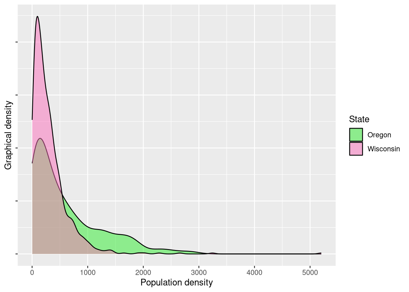
While a visual difference appears obvious, the proof lies in the statistical pudding. Ignoring the obviously violated assumption of [spatial] independence (which I feel comfortable doing when this is purely exploratory), we’ll use a Wilcoxon ranked sign test to compare distributions as opposed to an independent samples t-test since the distributions are clearly not normally distributed.
	Wilcoxon rank sum test with continuity correction

data:  wi_pop$pop_dens and or_pop$pop_dens
W = 131502, p-value = 0.0000000001676
alternative hypothesis: true location shift is not equal to 0
The near-zero p-value demonstrates that there is a significant difference between in the residential population densities within the two states. However, as we discussed before, we cannot attribute this entirely to the UGBs (if at all). Oregon possesses significantly more geographical barriers in the Coast Range and Cascade Range along with a sparsely populated high desert. Wisconsin possesses geographic barriers too, but these barriers are simply different. Wisconsin’s 15,000+ lakes restrict residential development – albeit to a less degree – and overall the state’s geography is more homogeneous.
Secondary comparison: Tennessee and Kentucky
Finding two states with similar geographies is difficult in itself, let alone
two with similar geographies but different mandates regarding UGBs. Tennessee
and Kentucky perhaps serve as the most fitting pair: these two states share a
large border, and while Tennessee is unquestionably more mountainous, both have
significant topographic variation (in their eastern regions in particular).
Conveniently, we can simply subset the us_pop variable to get these two new
states.
ky_pop <- us_pop %>%
  filter(state == 21) %>%
  mutate(state_name = "Kentucky")

tn_pop <- us_pop %>%
  filter(state == 47) %>%
  mutate(state_name = "Tennessee")

dat <- rbind(ky_pop, tn_pop)

## density plot
ggplot(dat, aes(x = pop_dens, fill = state_name)) +
  geom_density(alpha = 0.5) +
  scale_fill_manual(values = c("#ffe700", "#4deeea")) +
  xlab("Population density") +
  ylab("Graphical density") +
  scale_y_continuous(labels = NULL) +
  guides(fill = guide_legend(title = "State")) +
  theme(axis.text.y = element_blank())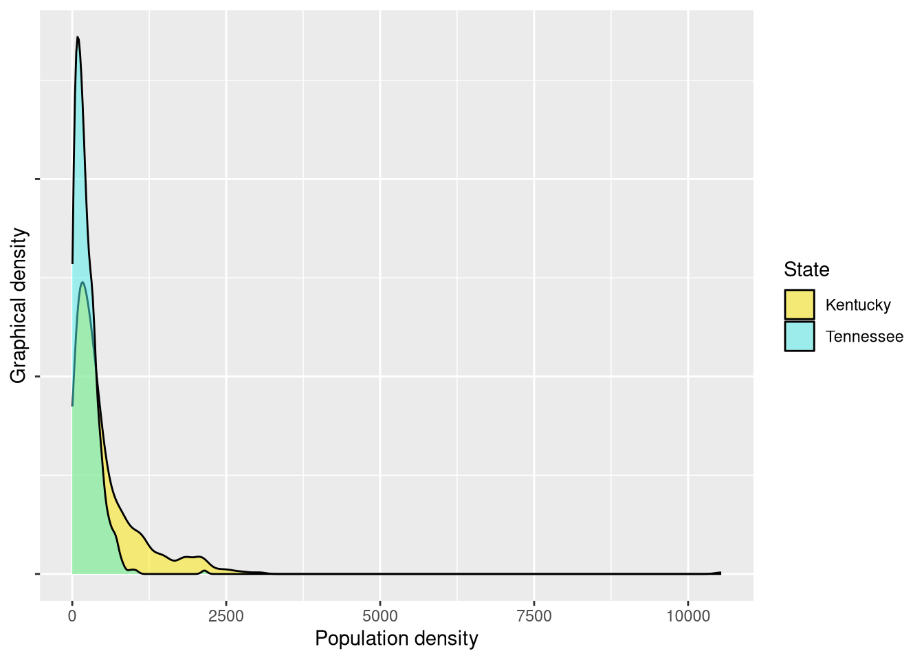
Here, we again see what appear to be visually distinct patterns. Tennessee has a higher peak around lower values, indicating what appear to be lower densities. A statistical test again reveals significant differences.
	Wilcoxon rank sum test with continuity correction

data:  ky_pop$pop_dens and tn_pop$pop_dens
W = 187653, p-value < 0.00000000000000022
alternative hypothesis: true location shift is not equal to 0
Tertiary comparison: Wisconsin and Kentucky
Since Kentucky and Tennessee did have significantly different densities, but the state without UGBs has the higher densities, it’s perhaps worth comparing the two states without UGBs: Wisconsin and Kentucky.
## bind for use in ggplot2
dat <- rbind(wi_pop, ky_pop)

## density plot
ggplot(dat, aes(x = pop_dens, fill = state_name)) +
  geom_density(alpha = 0.5) +
  scale_fill_manual(values = c("#ffe700", "#fb70bc")) +
  xlab("Population density") +
  ylab("Graphical density") +
  scale_y_continuous(labels = NULL) +
  guides(fill = guide_legend(title = "State")) +
  theme(axis.text.y = element_blank())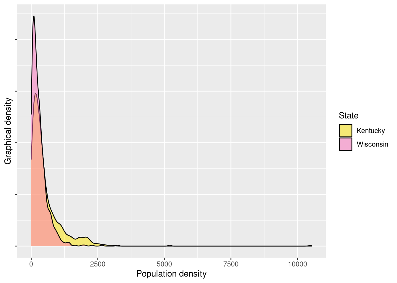
These appear more visually similar than the previous pair, but Wisconsin – like Tennessee – has a higher peak around its lower values. A statistical test again indeed reveals significant differences.
	Wilcoxon rank sum test with continuity correction

data:  wi_pop$pop_dens and ky_pop$pop_dens
W = 174265, p-value = 0.000000000009033
alternative hypothesis: true location shift is not equal to 0
Group comparison
At this point, it’s worth reflecting on these four state population densities together through some descriptive statistics and holistic visualizations. This is a bit out of order since descriptive statistics usually come before any inferential statistics, but this exercise is meant to be instructive in terms of how to probe a dataset with questions and address them as they come up, rather than a more formal academic sequential approach.
dat <- bind_rows(wi_pop, or_pop, ky_pop, tn_pop)

descriptive_stats <- function(dat) {
  dat %>%
    group_by(state_name) %>%
    summarize(across(c(pop_dens),
                     list(mean = mean, median = median, sd = sd),
                     .names = "{.col}_{.fn}"))
}

descriptive_stats(dat %>%
                  st_set_geometry(NULL)) %>%
  kbl(col.names = c("State",
                    "Mean population density",
                    "Median population density",
                    "Population denstiy standard deviation"),
      digits = 2) %>%
kable_styling(bootstrap_options = c("striped"))| State | Mean population density | Median population density | Population denstiy standard deviation |
|---|---|---|---|
| Kentucky | 530.07 | 320.05 | 689.67 |
| Oregon | 600.05 | 363.31 | 627.20 |
| Tennessee | 225.18 | 178.59 | 196.78 |
| Wisconsin | 315.24 | 225.85 | 359.27 |
Interestingly, Tennessee has lowest mean and median of the group. The standard deviations reveal that Oregon and Kentucky have much more dispersion in their population densities than Wisconsin or Tennessee. A ridge plot can help further compare dispersion and allows us to see all four distributions together:
ggplot(dat, aes(x = pop_dens, y = state_name, fill = state_name)) +
  geom_density_ridges(alpha = 0.5) +
  labs(x = "Population density", y = "State", fill = "State") +
  scale_fill_manual(values = c("Wisconsin" = "#fb70bc",
                               "Oregon" = "#31ed31",
                               "Kentucky" = "#ffe700",
                               "Tennessee" = "#4deeea")) +
  guides(fill = FALSE)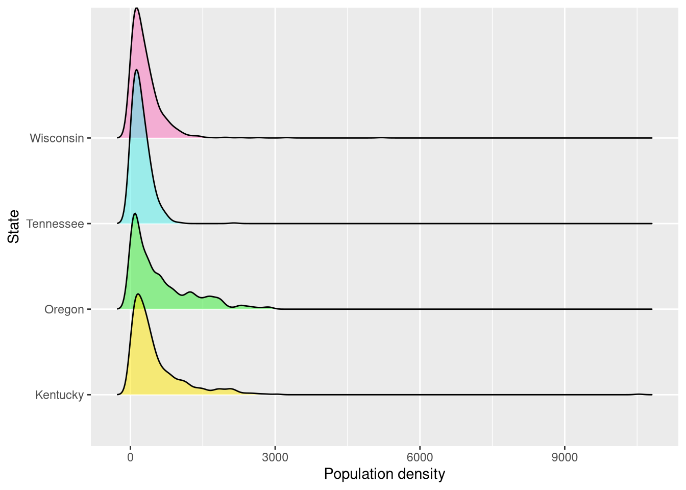
Conclusion
These comparisons are purely exploratory and say nothing definitive, but it is
interesting to note that Oregon and Tennessee produce the highest and lowest
respective aggregate population densities despite both having mandated UGBs.
From density plots, it’s clear that each state has significant high outliers
that warrant further inspection. These comparisons also raise further questions
– such as, what drives the higher population densities in Kentucky? And are
Oregon’s high densities the result of UGBs or some other policy decision? While
the story of these four states is far from settled, the approach here opens the
door for inspections of other state comparisons if desired (e.g., Wisconsin and
Minnesota or Washington and Arizona). The literate programming approach of R and
RMarkdown combined with spatial functions through sf creates a powerful
combination that enables statistical insight and replicability.